Introduction to mvtweedie
James T. Thorson
Introduction.RmdIntroducing the mvtweedie distribution for regression-based analysis of stomach contents
mvtweedie is n R package to interpret a Tweedie
generalized linear model (GLM) or generalized additive model (GAM)
involving multiple classes as an estimate of proportions for each class,
implicitly involving a multivariate-logit transformation for parameters
and predictions. This approach generalizes the Poisson-to-multinomial
transformation to allow for non-integer responses, and can analyze
either pre-processed (transformed to proportions) or raw (zero-inflated
positive real values) data.
This approach is helpful, e.g., when analyzing diet samples that are heavily zero inflated without pre-processing the samples prior to analysis. In these cases, the Tweedie distribution can be interpreted mechanistically as a thinned and double-marked Poisson point process representing foraging processes.
Ecological motivation
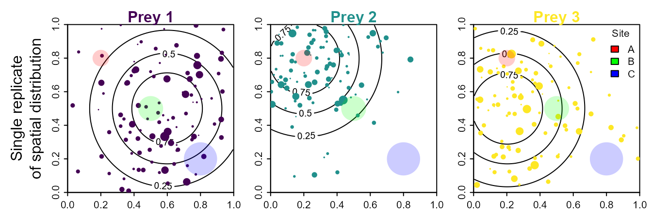
We propose thinking about diet samples as arising from a thinnned and double-marked point process, with marks representing prey category and size. To visualize this, we simulate a square spatial domain with three prey species, each having a different utilization distribution (shown using contours to indicate expected densities). We then simulate a single realization from this process, plotting the location and size for each individual of each prey species. We also imagine that a predator might be sampled at three different locations, and that it has recently foraged in areas of varied size, labeled sites A, B, and C (shown as shaded circles), where these foraging areas occur in areas with different densities of the three prey species.
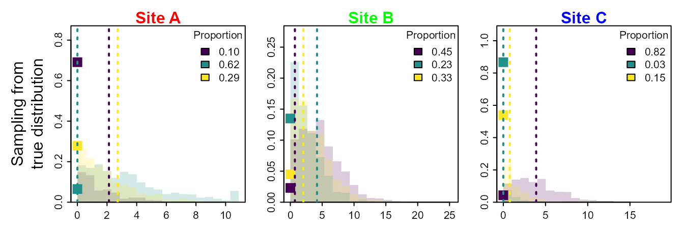
For this data-generating process, we can simulate multiple replicates to sample from the true distribution of prey proportions that occurred within those three sites A, B, or C. This will sometimes be zero for a given prey (which occurs when no prey individual is within that foraging patch), and is otherwise a continuous-valued and positive response (arising as the sum of prey size for all prey individuals in that area).
We first plot samples from this true distribution for the proportion of each prey at each site, and also calculate the average (expected) proportion for each prey at each site.
Finally, we can approximate that true distribution for prey proportions using a generalized linear model with a log-linked Tweedie distribution, and converting predicted prey densities to a proportion. We will call this a multivariate Tweedie distribution. However, we do not have a closed-form expression for its moment-generating function, so it could instead be interpreted as a “multivariate Tweedie generalized estimating equation”.
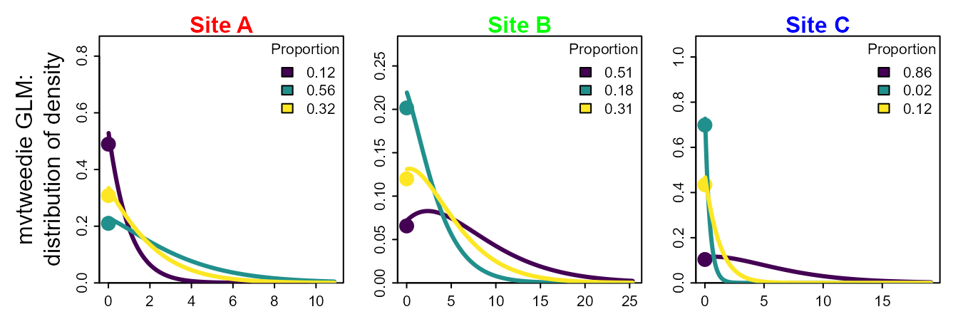
Given the potential for this multivariate-Tweedie distribution to approximate the true distribution for prey proportions (including both the proportion of zeros, the distribution for positive values, and the mean proportions), we therefore propose to use this log-linked Tweedie GLM to fit diet samples and predict resulting prey proportions.
Example application for tufted puffins on Middleton Island
So far, we have showed that the multivariate Tweedie distribution can approximate the sampling distribution from a double-marked point process. We next show how it can be specified as a distribution in a multi-class generalized linear model, infer covariate effects, and predict prey proportions. To do so, we first format our data as a long-form data frame, which includes a row for each combination of prey and sample, and columns for prey group and sample ID, the measured quantity in that diet sample for each prey, and any predictor and/or offset variables.
# Loading package
library(mvtweedie)

# load data set
data( Middleton_Island_TUPU, package="mvtweedie" )
Middleton_Island_TUPU$Year = as.numeric(as.character( Middleton_Island_TUPU$Year_factor ))

# Illustrate format
knitr::kable( head(Middleton_Island_TUPU), digits=1, row.names=FALSE)| Year_factor | Response | group | SampleID | Year |
|---|---|---|---|---|
| 1978 | 8.1 | Pacific sand lance | Middleton-TUPU-1978-1 | 1978 |
| 1978 | 1.4 | Pacific sand lance | Middleton-TUPU-1978-10 | 1978 |
| 1978 | 17.7 | Pacific sand lance | Middleton-TUPU-1978-11 | 1978 |
| 1978 | 1.0 | Pacific sand lance | Middleton-TUPU-1978-12 | 1978 |
| 1978 | 2.0 | Pacific sand lance | Middleton-TUPU-1978-13 | 1978 |
| 1978 | 2.2 | Pacific sand lance | Middleton-TUPU-1978-14 | 1978 |
We then fit a log-linked regression model for the prey samples, with multiple responses for each sample. In this case, we use mgcv to fit a Generalized Additive Model (GAM) and specifically include:
- a smoothing term
s(Year)that is shared among prey groups, representing variation over time in the expected prey biomass in each stomach; - a smoothing term
s(Year,by=group)that differs among prey groups, representing prey switching over time; - a group-specific intercept
0 + groupthat represents expected differences in prey proportion on average over time.
The first term is essentially a “detectability” covariate, representing changes in attack and capture rates over time that affect the sampled value for all prey in a given year. It could be replaced by a fixed or random effect for each sample, although such a model is slow using mgcv. It has a equal effect for predicted measurements for each prey category (due to us using a log-linked model), and therefore “drops out” when predicting prey proportions. Alternatively, we could pre-process the data such that each sample has a constant mean prey density. This will be (roughly) similar to marginalizing across the unmodeled variation in total prey measurement for each sample.
# Run Tweedie GLM
library(mgcv)
gam0 = gam( formula = Response ~ 0 + group + s(Year,by=group) + s(Year),
                  data = Middleton_Island_TUPU,
                  family = tw )

# Load class to enable predict.mvtweedie
mygam = gam0
class(mygam) = c( "mvtweedie", class(mygam) )
The fitted GAM gam0 does not include any covariance in
the response for each prey species (conditional upon the estimated
response to terms that are included in the formula).
However, predict(mygam) will now predict the response as
proportions across modeled categories, and does include a negative
covariance among categories.
Visualizing covariate responses
After fitting the model, we can visualize the predicted proportion for each prey as a function of covariates.
In this simple example, we can manually construct a predictive grid
for our covariate Year, calculate predictions, and then
plot using ggplot.
# Predict values
newdata = expand.grid( "group" = levels(Middleton_Island_TUPU$group),
                       "Year" = 1978:2018 )
pred = predict( mygam,
                se.fit = TRUE,
                origdata = Middleton_Island_TUPU,
                newdata = newdata )
newdata = cbind( newdata, fit=pred$fit, se.fit=pred$se.fit )
newdata$lower = newdata$fit - newdata$se.fit
newdata$upper = newdata$fit + newdata$se.fit

# Plot
library(ggplot2)
theme_set(theme_bw())
ggplot(newdata, aes(Year, fit)) +
  geom_pointrange(aes(ymin = lower, ymax = upper)) +
  facet_wrap(vars(group)) +
  scale_color_viridis_c(name = "SST") +
  ylim(0,1) +
  labs(y="Predicted proportion")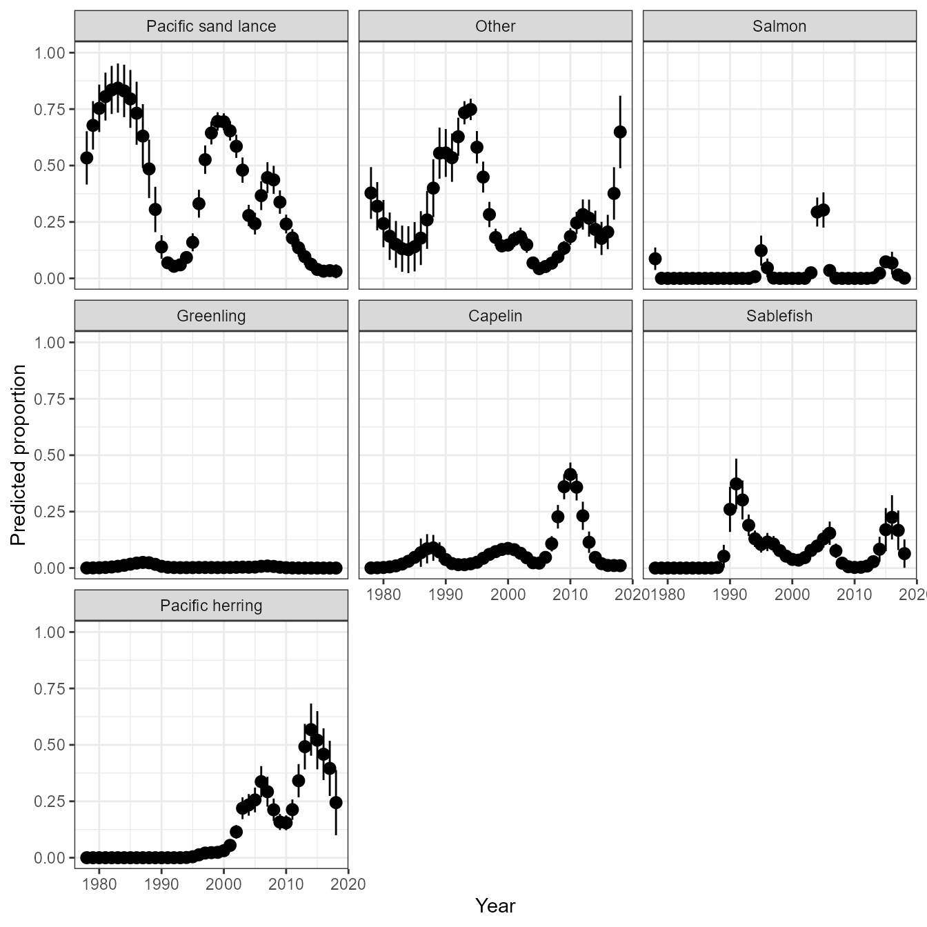
In more complicated models, however, it might be cumbersome to construct a full grid across all covariates. We can instead automate this process using third-party packages. Here, we show how to use pdp to calculate a partial dependence plot:
library(pdp)

# Make function to interface with pdp
pred.fun = function( object, newdata ){
  predict( object = object,
           origdata = object$model,
           category_name = "group",
           newdata = newdata )
}

# Calculate partial dependence
# approx = TRUE gives effects for average of other covariates
# approx = FALSE gives each pdp curve
Partial = partial( object = mygam,
                   pred.var = c( "Year", "group"),
                   pred.fun = pred.fun,
                   train = mygam$model,
                   approx = TRUE )

# Lattice plots as default option
library( lattice )
plotPartial( Partial )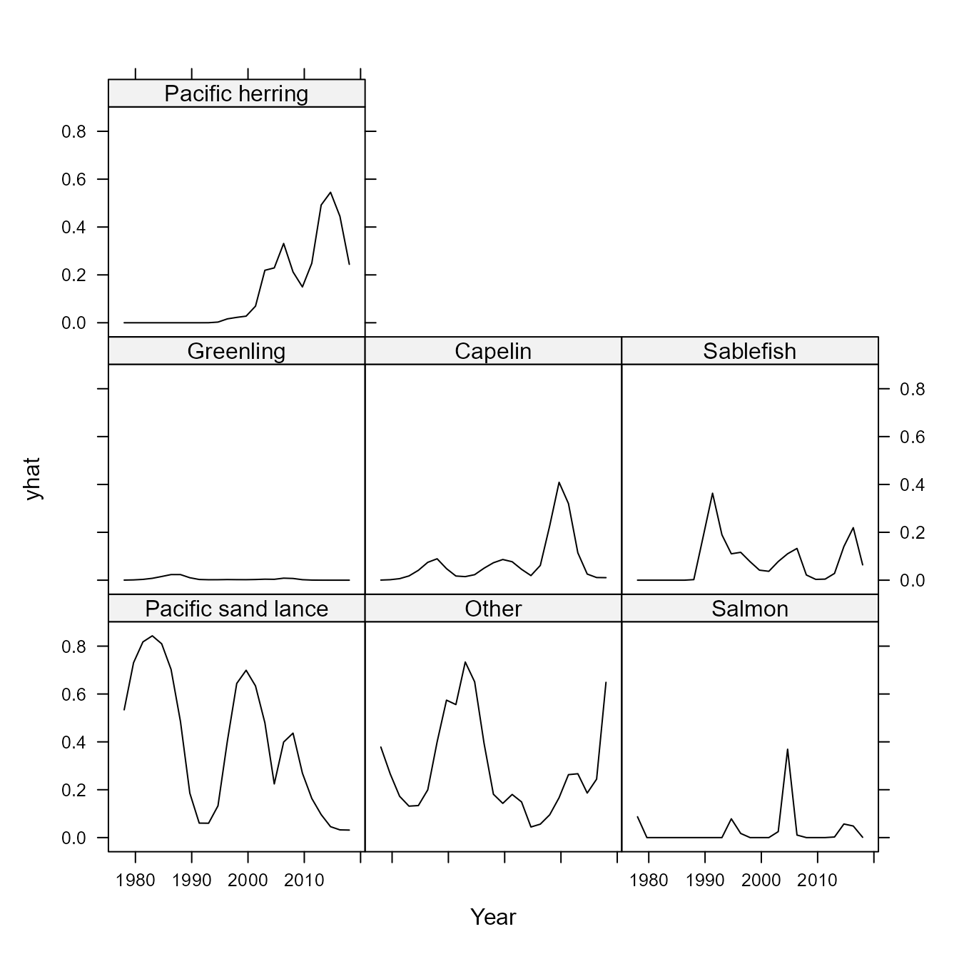
# using in ggplot2
ggplot(data=Partial, aes(x=Year, y=yhat)) + # , group=yhat.id
  geom_line( ) +
  facet_grid( vars(group) ) +
  labs(y="Predicted proportion")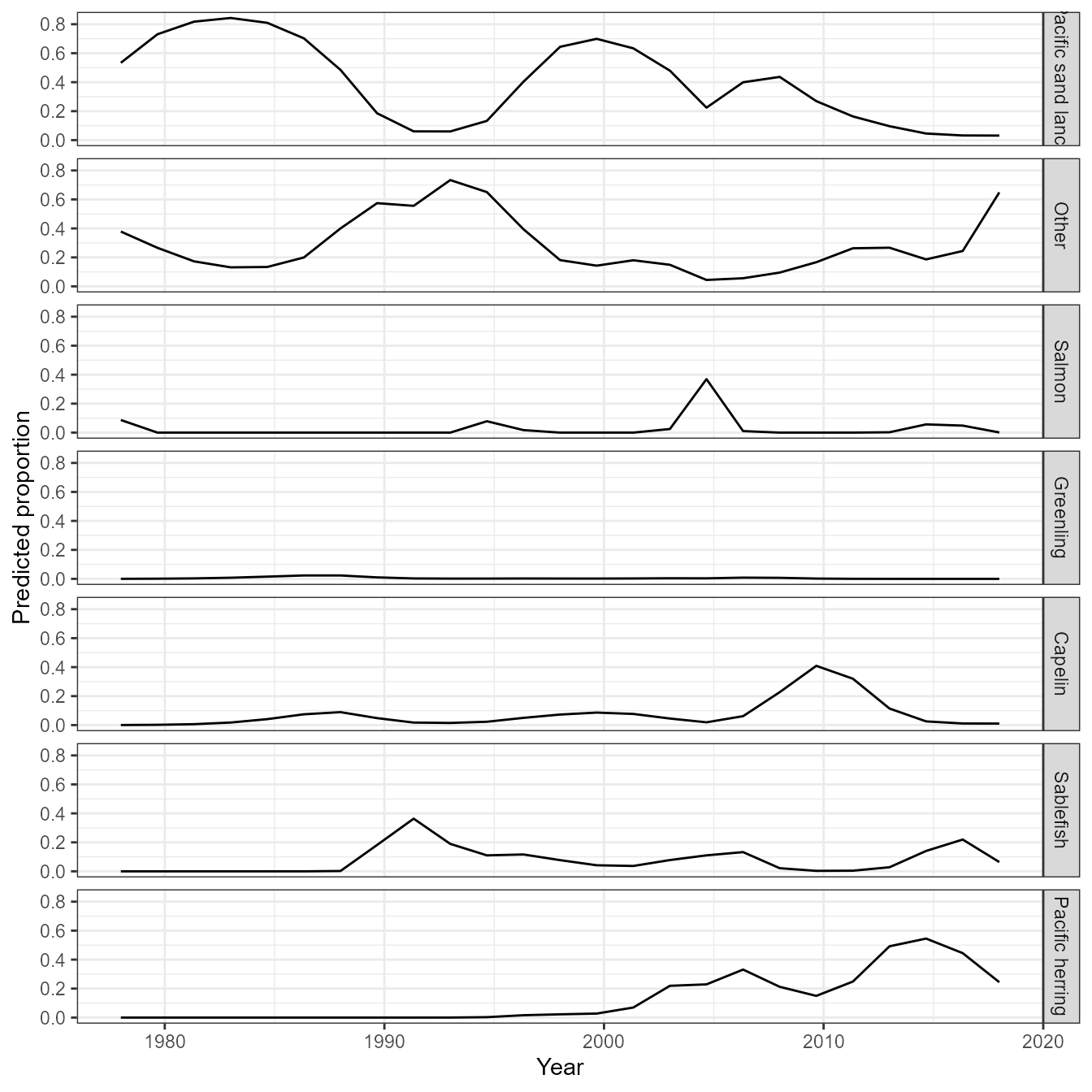
In this simple example, the partial dependence plot and predictive grid both result in the same visualization of effects. However, this is not guarunteed to be the case in models with more covariates.
Spatial analysis of wolf prey
We next demonstrate how the multivariate Tweedie can be used in a spatial analysis to predict diet proportions. We use samples of environmental DNA from wolf scats collected in southeast Alaska, and restrict analysis to four selected prey species to speed up model fitting (the model would likely be faster using software that is specialized for multivariate spatio-temporal analysis).
# Load data
data(southeast_alaska_wolf)
groups = c("Black tailed deer","Marine mammal", "Mountain goat", "Beaver")
southeast_alaska_wolf = subset( southeast_alaska_wolf,
                                group %in% groups )

#
southeast_alaska_wolf$group = factor(southeast_alaska_wolf$group)

# Illustrate format
knitr::kable( head(southeast_alaska_wolf), digits=1, row.names=FALSE)| Latitude | Longitude | group | Response |
|---|---|---|---|
| 55.2 | -131.8 | Black tailed deer | 1469.7 |
| 58.4 | -135.7 | Black tailed deer | 4684.2 |
| 55.8 | -133.0 | Black tailed deer | 24852.5 |
| 55.8 | -133.0 | Black tailed deer | 112592.0 |
| 56.2 | -133.0 | Black tailed deer | 3585.5 |
| 55.5 | -132.8 | Black tailed deer | 40730.0 |
We then fit a generalized additive model with a tensor-spline interaction of Latitude and Longitude.
# Using mgcv
gam_wolf = gam( formula = Response ~ 0 + group + s(Latitude,Longitude,m=c(1,0.5),bs="ds") +
     s(Latitude,Longitude,by=group,m=c(1,0.5),bs="ds"),
  data = southeast_alaska_wolf,
  family = tw )
class(gam_wolf) = c( "mvtweedie", class(gam_wolf) )
Finally, we define a function that computes predictions on a grid formed from different values of each predictor:
predict_grid <-
function( model,
          exclude_terms = NULL,
          length_out = 50,
          values = NULL,
          ... ){

  if( !any(c("gam","glmmTMB") %in% class(model)) ){
    stop("`predict_grid` only implemented for mgcv and glmmTMB")
  }
  n_terms <- length(model[["var.summary"]])
  term_list <- list()
  for (term in 1:n_terms) {
    term_summary <- model[["var.summary"]][[term]]
    term_name <- names(model[["var.summary"]])[term]
    if (term_name %in% names(values)) {
      new_term <- values[[which(names(values) == term_name)]]
      if (is.null(new_term)) {
        new_term <- model[["var.summary"]][[term]][[1]]
      }
    }
    else {
      if (is.numeric(term_summary)) {
        min_value <- min(term_summary)
        max_value <- max(term_summary)
        new_term <- seq(min_value, max_value, length.out = length_out)
      }
      else if (is.factor(term_summary)) {
        new_term <- levels(term_summary)
      }
      else {
        stop("The terms are not numeric or factor.\n")
      }
    }
    term_list <- append(term_list, list(new_term))
    names(term_list)[term] <- term_name
  }
  new_data <- expand.grid(term_list)
  class(model) = c( "mvtweedie", class(model) )
  pred <- predict( model,
                   newdata = new_data,
                   se.fit = TRUE,
                   #original_class = c("gam","glm","lm"),
                   ...)
  predicted <- as.data.frame(pred)
  predictions <- cbind(new_data, predicted)
  return(predictions)
}
We use this function to visualize prey proportions across the landscape of southeast Alaska that is inhabited by wolves:
library(rnaturalearth)
library(raster)
library(sf)
library(dplyr)
# Predict raster on map
pred_wolf = predict_grid( gam_wolf,
                 origdata = southeast_alaska_wolf,
                 length_out = 100 )
pred_wolf$cv.fit = pred_wolf$se.fit / pred_wolf$fit

# Map oceanmap layer
US_high = ne_countries(scale=50, country="united states of america")
st_box = st_polygon( list(cbind( x=c(-140,-125,-124,-140,-140),
                                 y=c(50,50,60,60,50))) )
st_box = st_sfc(st_box, crs=st_crs(US_high) )
wmap = st_intersection( US_high, st_box )
oceanmap = st_difference( st_as_sfc(st_bbox(wmap)), wmap )

sf.isl <- data.frame(island = c("Baranof", "Chichagof", "Admiralty"),
                     lat = c(57.20583, 57.88784, 57.59644),
                     lon = c(-135.1866, -136.0024, -134.5776)) %>%
  st_as_sf(., coords = c("lon", "lat"), crs = 4326)

mask.land = ne_countries(scale=50, country="united states of america", returnclass = 'sf') %>%
  st_set_crs(., 4326) %>%
  st_cast(., "POLYGON") %>%
  st_join(., sf.isl) %>%
  filter(!is.na(island))

# Make figure
my_breaks = c(0.02,0.1,0.25,0.5,0.75)
ggplot(oceanmap) +
  geom_tile(data=pred_wolf, aes(x=Longitude,y=Latitude,fill=fit)) +
  geom_sf() +
  geom_sf(data = mask.land, inherit.aes = FALSE, fill = "darkgrey") +
  coord_sf(xlim=range(pred_wolf$Longitude), ylim=range(pred_wolf$Latitude), expand = FALSE) +
  facet_wrap(vars(group), ncol = 5) +
  scale_fill_gradient2(name = "Proportion", trans = "sqrt", breaks = my_breaks) +
  scale_y_continuous(breaks = seq(55,59,2)) +
  scale_x_continuous(breaks = c(-135, -133.5, -132)) +
  theme(axis.text = element_text(size = 7))
These results visualize spatial prey switching, e.g., a greater proportion of marine mammals in wolf diets in islands.